A new visual identity for the Grand Hotel, Brighton
VISUAL IDENTITY | DESIGN | PRINT
Grand Hotel, Brighton
CREATION OF A VISUAL IDENTITY FOR AN ICONIC HOTEL
Following the change of ownership which saw The Grand change hands from the De Vere Group to a private investor, there became an urgent need to create a standalone identity for the extensively refurbished hotel.
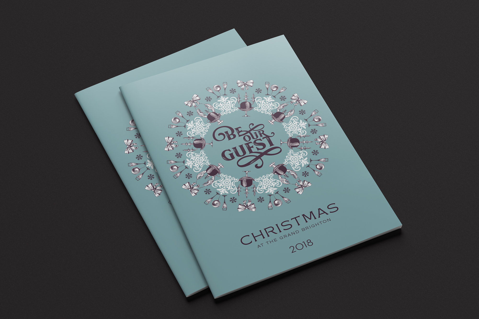
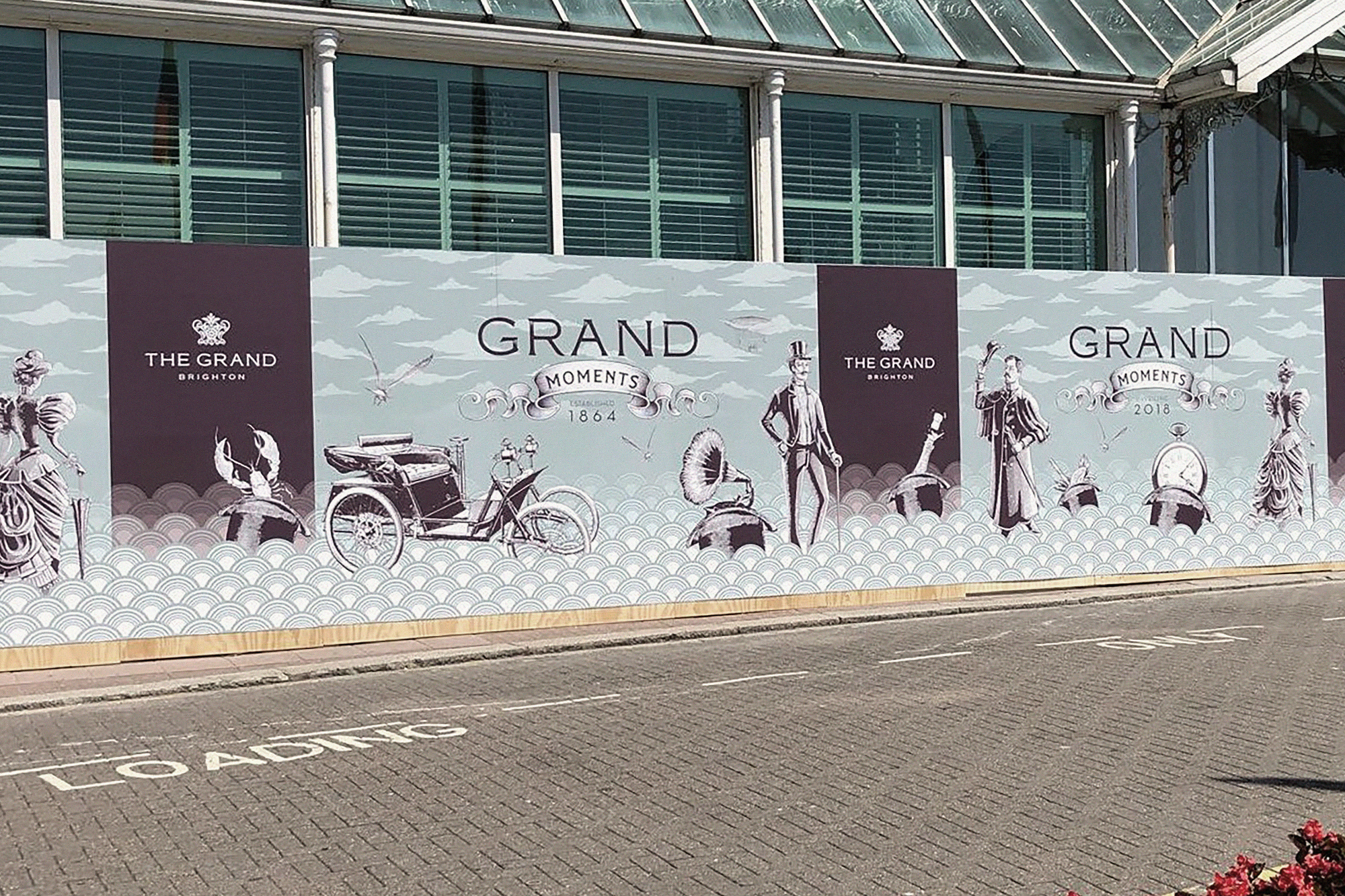
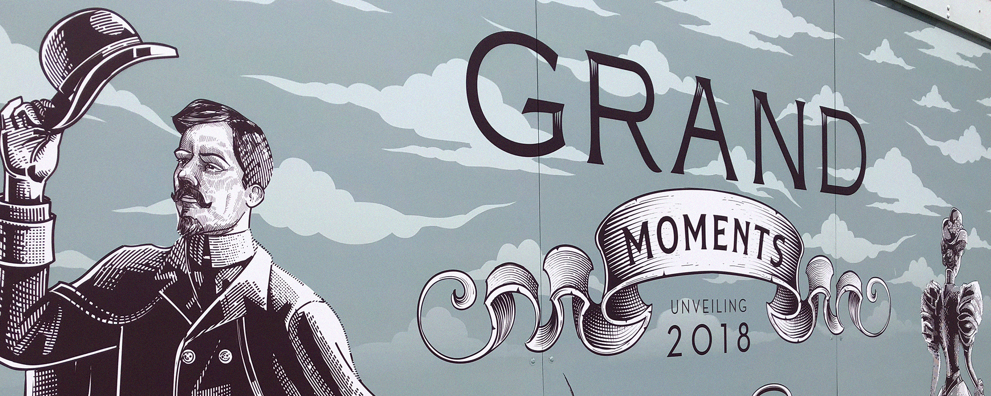
We chose to celebrate the hotel’s proud tradition and heritage with a fresh, modern take and with a firm nod to its position as the forward-looking, ambitious hotel that we see today. We took inspiration for the identity from the fabulous, intricate patterns of the wrought iron balconies and balustrades that make up the frontage of the hotel and feature on the imposing central staircase that greets visitors as they enter into the reception. This style of ironwork was the pride of Britain at the time the hotel was built. Full of national confidence, Britain led the world with the craftsmanship of producing these items which were a direct result of the advances it had made during the industrial revolution. Now they are synonymous with Victorian Britain and a fabulous starting point for The Grand’s new identity.
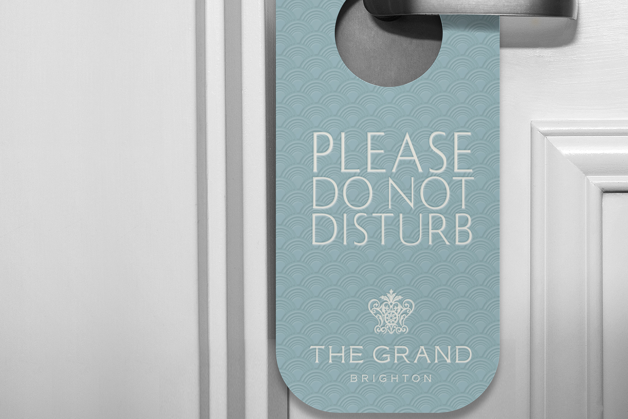
We shaped the section we had identified as the basis of the logo’s icon into a more regal, crown-like marque. We commissioned renowned iconographer Chris Mitchell to apply the finishing touches to a logo which now looks stunning paired up to the word marque. To add a seaside touch, we created flourishes on the base of the icon that echoed waves – a device that also formed the basis of the secondary graphic device used on much of the hotel’s collateral.